Art Direction
Campaign creative developed at the International Rescue Committee—a global humanitarian aid organization. From inception through launch, I was the primary designer on these campaigns, developing creative concepts and designing key assets myself, while also overseeing other designers, freelancers, and our video production team to ensure all materials were visually consistent.
̌
International Rescue Committee’s 2024 Emergency Watchlist
Each year, the International Rescue Committee (IRC) creates the Emergency Watchlist, an report which assesses the 20 countries at the greatest risk of new humanitarian emergencies in the coming year. In both 2023 and 2024, I had the privilege of being the creative lead, creating the entire 50+ page report design myself, as well as the broader creative concept which was implemented across numerous channels and products. Some of these additional products I created, while others were created by freelancers and fellow designers on my team with my direction.
In 2024, our theme was “No Myths, Just Facts,” in which we sought to correct common misconceptions about the global geopolitical landscape and how these misconceptions can worsen the risk of crises. From a creative perspective, I sought to highlight the polarity of myth and fact by focusing on simple, high contrast design. Minimalist data visualizations and sparing use of elegant graphic elements allowed readers to focus on "just the facts"—no unnecessary flourishes obscuring the truth. A strategic use of white space further symbolizes the stark reality of the Emergency Watchlist's subject manner, while making the overall design cleaner and easier to navigate. Using both iconography and custom-created lettering, I played with the idea of how myths or misinformation only provides part of the larger picture, often obscuring the truth, strategically using dotted lines and broken lettering. Composite images which incorporated black and white photography once again played on the myth vs fact polarity, but in literally turning these black and white slivers upside-down, they serve as a representation of how the myth is but a distortion of the reality.
To understand more about the Watchlist and read the complete report, click here.
Early moodboard concepts once overall creative direction had been solidified.
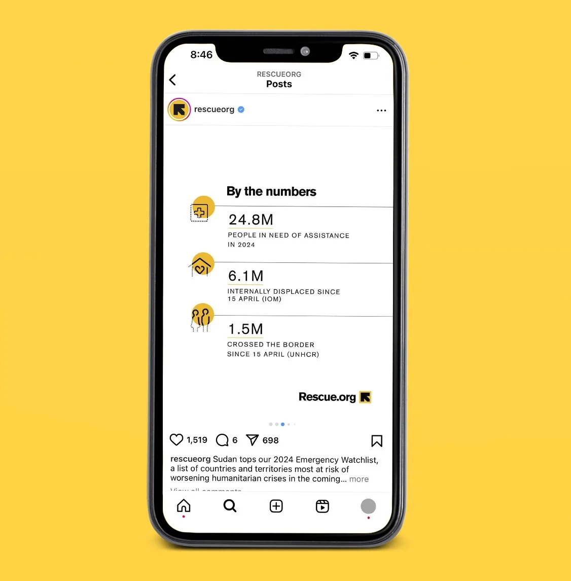
Example of Instagram swipe-through post which established how we could adapt the concept for digital content.
International Women’s Day
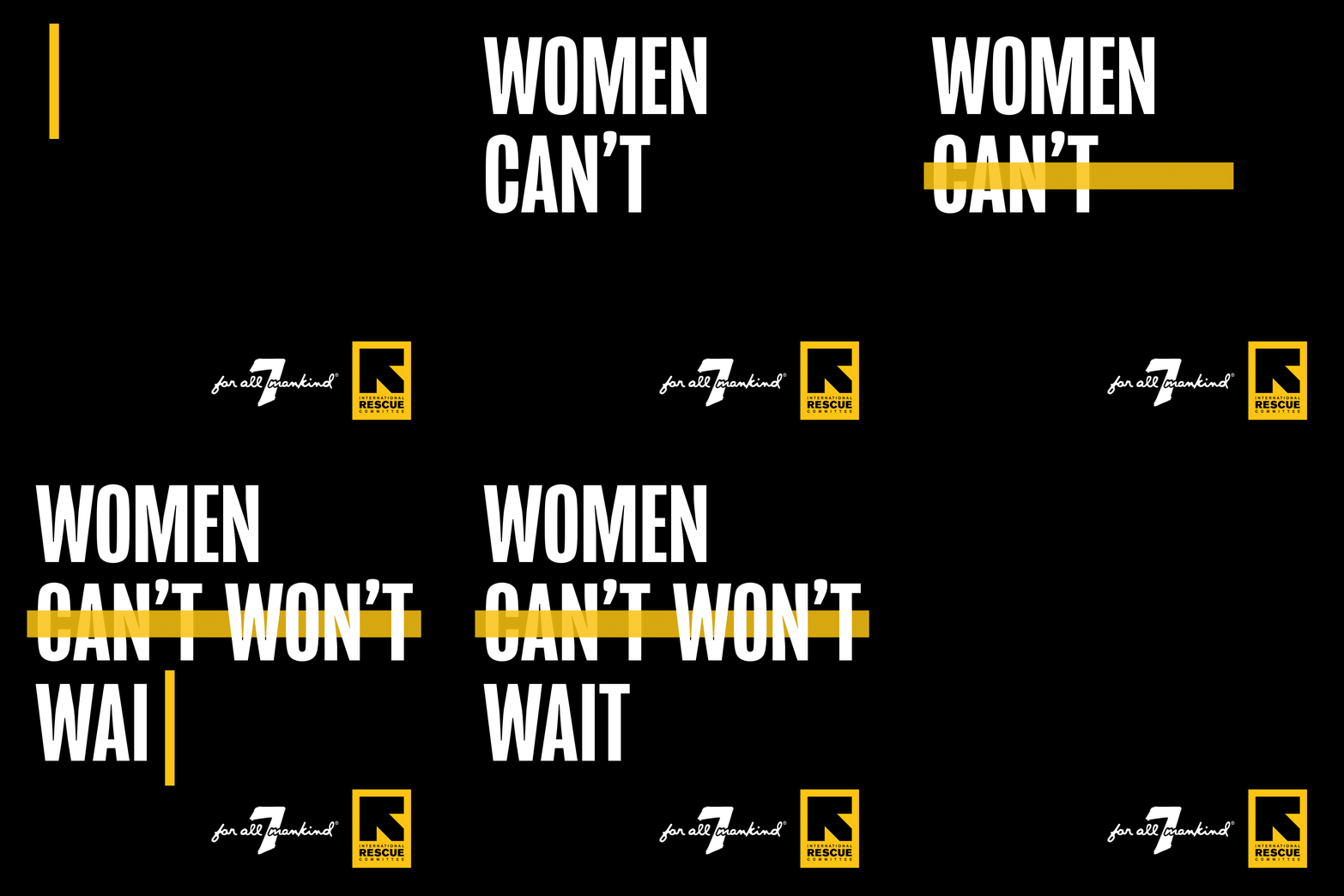
This was the first campaign at the IRC on which I was creative lead. The IRC’s commitment to promoting safety, equity, and empowerment of women and girls around the world is among the top reasons why I was most drawn to working with them, so I was especially excited to be working on this campaign. With the current political climate around the world being often very hostile towards women and gender equality, we wanted this campaign to feel bold and powerful, but ultimately with a positive outlook, highlighting how change is still possible. In a world where women are often forced to make themselves smaller, large scale typography on a stark black background literally takes up space and makes the message impossible to ignore. Incorporating a strike-through in “can’t” with the tagline “Women Can’t Won’t Wait” emphasizes the need for action, that change is and must be actively in progress, right now.
Early moodboards and concept mocks.
Campaign mantra graphic created for our Global/US channels, as well as Germany and Sweden.
Examples of work created for partnership programs, including 7 For All Mankind and Feminist.


